
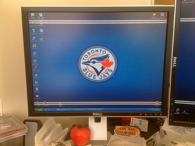
New logo means new wallpaper
The Toronto Blue Jays Baseball Club officially revealed there new logo and uniforms today. I like them. They pay homage to the logo and colours of the past which adorned the 1992 and 1993 World Series-winning campaigns but with a freshening up. The past 18 years have produced mediocre-to-lousy teams with lousy logos. The past year or two have been more promising and recent acquisitions and expected ones bode well for the future. My workplace screens needed a fresh image so the unveiling was well timed (even though the logo was leaked back in September).
The Toronto Star has a good report with links to Jays' logo and uniform histories and other good stuff (if you are interested) - including a gallery of Star readers' uniform designs. A few are interesting - even good - but most are horrible.
395
views
- 0
- 0
- Apple iPhone 3G
Comments
Sign in or get an account to comment.


