
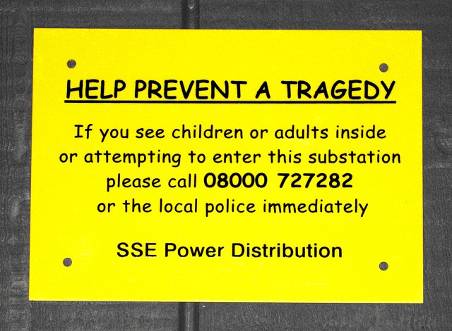
Tragic Sans
I walk past this sign every day. It really bugs me that something that may kill you has a warning written in Comic Sans, a font that was designed for cartoon speech bubbles and is considered ugly and poorly designed by the cartoon illustrators, and excessively and inappropriately overused by designers and typographers.
I have dyslexia and for some reason it's widely quoted that it is easy to read if you suffer, though if you follow the trails there is very little evidence to back this up. The best quote I found was that some people with dyslexia found it easier to read and some found it harder... I hate it and would ban it if I could...
I believe that current wisdom is now that sans-serif fonts are easier to read - which there is good evidence for - and as Comic Sans has sans in the name, I think a lot of people pick it without realising that there are plenty of better sans-serif fonts on their computer without having to use this travesty.
end rant...
Comments
Sign in or get an account to comment.


