
Ugly new mailboxes - on purpose
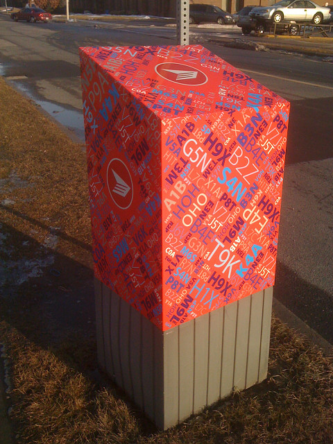
For a year or so now, Canada Post has been replacing curbside post drop boxes with the new look. They are the same boxes, but with a "fresh" wrapper or paint job (I'm not sure which). They are busy looking to say the least. I think they are ugly. Hideous, in fact. However, there is method to the madness. Apparently, they make it very difficult for graffiti taggers to mark because they are so busy looking. The old boxes were just painted red and had the logo on them. They were getting faded, rusty, etc. and needed updating. Sigh.
For the unfamiliar, the design (this is a back view) depicts Canadian postal codes. In Canada they are paired-sets of three opposite to those used in UK. We go letter-number-letter number-letter-number. For example, nearby York University is M3J 1P3. The first letter denotes the general geographic area. Those early in the alphabet are from eastern provinces. As you go west, the letters increase. M is Toronto and is roughly in the middle of the country both geographically and via population spread. Out BC way many postal codes begin with V.
What is also interesting to note is that it is January 31 - dead in the middle of our infamous winters. Only, as you can see, WHAT WINTER? Climate change has given us a remarkably pleasant winter. It was +7C today and sunny thus melting what little snow we got overnight and back on Saturday. A similar day of +5 awaits us tomorrow. What you should see is the top half of the mailbox sticking out of a snow drift with sidewalks more like trenches or canyons in the snow. THAT would be normal for this time of year.
333
views
- 0
- 0
- Apple iPhone 3G
Comments
Sign in or get an account to comment.


