
Photo Protocol
If the tone seems a little over the top it is because I am trying out the suggested photography style suggested for brand related photography. I found an 18 page power point print-out on the subject today. It was mostly examples and large print but still.... 18 pages! I think I get the idea and this is one of the approved tones for two tone shots (basically gold to copper). There was a load more about colour processing, composition requirements and overall style. I'm impressed that they've thought this through, as it will take the pressure off my framing and processing choices.
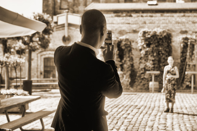
I offered to take a shot of these two, my first ever shot with an iPhone, they said they were pleased with the result...... I'll never know.
Comments
Sign in or get an account to comment.


