
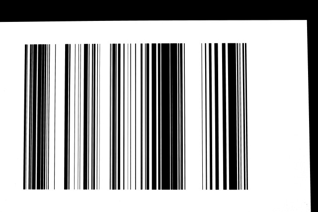
Ceci n'est pas une barcode
I'm currently exploring ways of getting NHS managers to understand that there's a small group of people who generate vast amounts of health service workload.
Here is my latest attempt.
It's not a barcode. It's a graph. The horizontal axis runs from 1st January 2007 through to 31st December 2011. So we're looking at five years here.
And we're looking at one person's contact with their local general hospital over these last five years. When it's black, they were in a hospital bed. When it's white they were at home.
My latest idea is that I put thousands of these barcodes into a movie and show them in rapid sequence at the rate of about five per second so that people can start to see more clearly who's a user and who's a super-user, and is there anything we can do about it.
But it's just an idea.
If I want to be pretentious about this, I could say that it's exploratory data analysis.
395
views
- 0
- 0
- Canon EOS 60D
- 1/50
- f/4.5
- 33mm
- 250
Comments
Sign in or get an account to comment.


