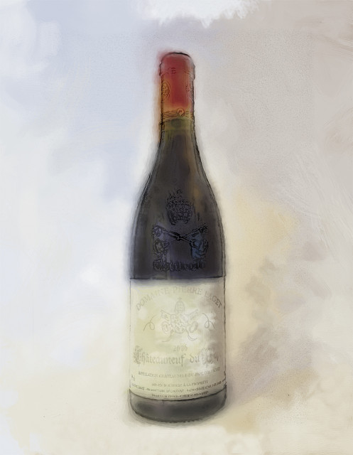
Stage 2 - Colour wash / Pencil
Quickly posting stage 2, as I have to dash!
May not seem like much has changed, but in fact there's more work in this stage than the previous! I guess you'd need to look larger to notice.
Afraid my hand rendering of letters has never been good, not got a steady enough hand, particularly after 2 or 3 coffees this morning. But the advantage of 'puters' is that you can soften your efforts so they don't look as bad. In the old days, my paint brushes on gel would not behave and a tissue on the end of a scalpel was nowhere near as effective. So pretty happy with this effort here. Even managed to pick out the shadows on the bottle above the label, so I should be able to get a reasonable result.
Issue, now that I'm at this stage, is how far I go, how 'realistic' to make it. I'm probable favouring pretty loose, as I quite like the overall background where normally I would add more depth, but I quite like the feeling of suspension it gives to the bottle, and yet I still feel it is actually stood on something, albeit undefined. I welcome any thoughts, including those like "don't give up the day job!"
245
views
- 0
- 0
- Canon EOS 500D
- 1/100
- f/3.5
- 23mm
- 100
Comments
Sign in or get an account to comment.


