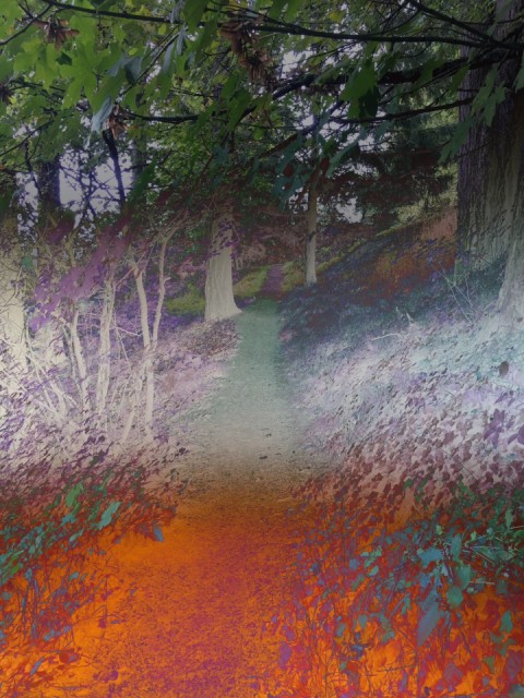
Mt. Tabor Gradient Path
I had been looking at the Tabor terrain on my morning run, but the path was not that abstract. I blipped it just in case.
Then, I glanced down at the image on the iPhone as it sat in the utility tray in the car. An extremely good three color gradient was there for the taking. So I blipped that.
I used PS Touch on the iPad to combine the two. A great inexpensive app. First the gradient, then the Tabor path on top of it, and reduced the opacity to favor that gradient.
Then I applied the Blending Mode of 'Difference' to create that alternate dimension look.
This is Abstract Thursday, tagged AT67, and no theme, as it is the first of the month.
Next week, October 13, the theme will be "Pastel". As mentioned in Wikipedia, here is something to color your imagination:
"Pastels or pastel colors are the family of colors which, when described in the HSV color space, have high value and low to intermediate saturation. The colors of this family are usually described as "soothing", "soft", "near neutral", "milky", "washed out", "desaturated", and lacking strong chromatic content."
Paste the tag AT68.
375
views
- 31
- 1
- Apple iPhone SE
- 1/30
- f/2.2
- 4mm
- 160
Comments
Sign in or get an account to comment.


