
Global warming, illustrated.
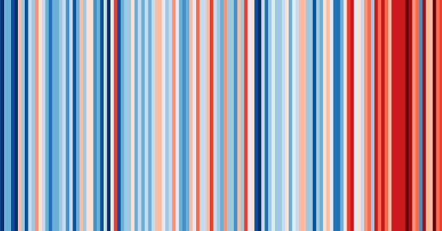
These ‘warming stripe’ graphics are visual representations of the change in temperature as measured in the UK over the past 100+ years. Each stripe represents the temperature in the UK averaged over a year.
A brilliantly simple way to illustrate how real global warming is, put together by Professor Ed Hawkins.
Check this out for yourself at https://showyourstripes.info and look up your country and region.
187
views
- 6
- 0
Comments
Sign in or get an account to comment.


