Display
What a strange exhibition at the Fashion and Textile Museum marking the 150th year of the Royal School of Needlework. I didn't quite understand how the combined roles of the Royal School of Needlework - the skilled, intricate work of embroidering things for important people and events and the teaching of those skills - quite fit together but it was interesting to see the results of both activities.
The wearing of cloths of gold and endless velvet trains fit for royals or the magnificent embroidered cathedral vaults on the back of an archbishop's robes or a dress made of ostrich feathers was way beyond my comprehension and station but the skill and sometimes the aesthetics were entrancing.
Then there was the student work. The projects they'd been set were deadly: 'embroider a saint, an animal and a symbol' and there they were, beautifully embroidered stolid shapes on the material with no connection between them. Why were the students not being shown how to interpret a brief with imagination, or at least in an interesting way? One did - a glorious Icarus riding towards the sun, but most of the rest were just boring.
And the perplexing way things were displayed! When I did a low-level graphic design qualification we were shown the basic techniques of displaying our work: mounting, framing (or not), position, juxtaposition, lighting, space... This is a museum with, presumably, qualified exhibition staff but hangings were lopsided, the patchy lighting meant that many things were hard to see and worst of all that Red Dress, whose display in Swansea ceridwen criticised, was up against a wall with a curtain behind so only half of it was visible. Why?
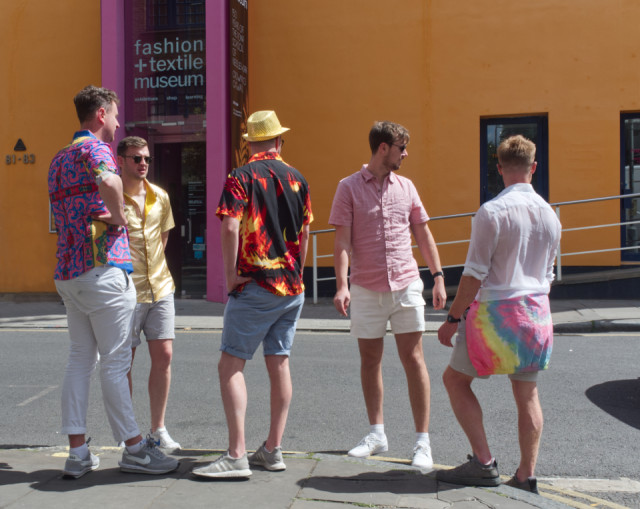
Anyway, these guys understood display.
Extra: juxtaposition.
Comments
Sign in or get an account to comment.


