
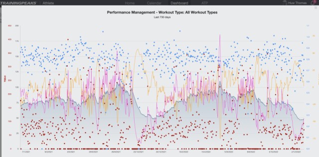
Fitness graph
Fitness graph - up and down over the last two years. Solid Graph is fitness, red is fatigue and yellow is form. Dip in middle was fractured ribs and the lower dips this year we inactivity from covid and recent motivational issues. Peaks were Picos cycling trip this year and Scottish borders last summer.
Back on the bike and rower now... working hard to improve fitness again so graph on the way back up. Pink line on graph=fatigue is rising as I work harder, and will drag fitness up with it ! Fighting aging all I can.
Comments
Sign in or get an account to comment.


