
Vernacular typography - TG McCarthy & Son
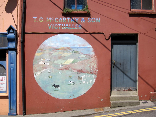
This is a really extraordinary piece typography. It's seen better days, but I love the approach to the image and the lettering. In case you can't make it out too clearly in the photo, the letters have a landscape within them, presumably an impression of Bantry Bay.
Typographically speaking, imagery inside letter forms is generally a bad idea - and it's easy to see why here because the letter forms and the landscape within them create a dissonance - you can't focus on one and the other both at the same time.
Nevertheless, the effort that has been applied to this sign is memorable. I am not completely sure what type of 'Victualler' McCathy was - going by the image one might expect some kind of butcher's shop, but the usual dictionary definition is an 'Inn Keeper'. So we have cows grazing round a stone circle, admiring the view over the bay and looking generally pastoral and contented - the kind of image McBurger chains would like to convey - but maybe this was actually a pub? So the dissonance continues throughout the whole sign. (Thinking about it, there is an off-licence opposite so maybe this is actually connected to it).
And wouldn't you like to know what is behind that door? The road is extremely busy so you wouldn't want to trip down those steps in a hurry!
479
views
- 0
- 0
- Canon PowerShot S90
- f/5.6
- 13mm
- 80
Comments
Sign in or get an account to comment.


