
Typography
I'm fussy about fonts and typography. I write code and use computers for a living so what I'm looking at matters to me a lot. I also have dyslexia, so how it looks impacts how I read things.
I split fonts into four basic families.
Your classic variable pitch serif type face, such as Times New Roman, which has been used in newspapers and books for years. These fonts are variable with, so the i is narrow and the W is wide, and at the end of the letter forms there are little tags of serifs that help to connect it to the next letter. They were thought to be easier to read like this, though it's now believed to not be true, and they often don't look so good on computer screens.
Next up are your variable pitch sans-serifs, which are variable in width again, but have had the serifs removed (mostly or entirely). This family are much younger, and were only used for heading and on posters for most of the twentieth century because they were erroneously believe to be hard to read (they aren't) and because some people thought they were ugly. On computers they generally are easier to read and most office software now usually defaults to a sans-serif font by default. They are also recommended for people with dyslexia. Famous examples are Helvetia or it's less pretty clone Arial.
Next up there are the various script and decorative fonts. These are usually variable in pitch and are often made to look like handwriting or are decorative in some other way. They are often hard to read, but can be used for special effects. They can be serif or sans-serif in form, and I don't have much use for them. I put Comic Sans in this category as it's a designed to look like handwriting in a comic, and though it is a sans-serif font, it's not especially easy to read and there is no evidence it helps people with dyslexia - though people do keep suggesting it, even though there isn't any evidence (to be fair there isn't much evidence for ANY dyslexia friendly font).
Finally there is the one class I care about above all others. That's the monospaced or fixed pitch fonts. They can be serif or sans-serif, but they are special because each character is exactly the same size as every other character. This is how old typewriters used to work and is not as easy to read as variable pitch for most purposes, but because the characters are all the same size is useful when you need regularity.
I write computer programs for a living and use the command line, both these cases normally use a fixed pitch font by default. There are subtle differences between the two, but for neat formatting fixed pitch fonts are essential. There are typefaces that resemble older typewriter fonts such as Courier, but there are also more modern typefaces that take their hints from other fonts but make them work in a monospaced world.
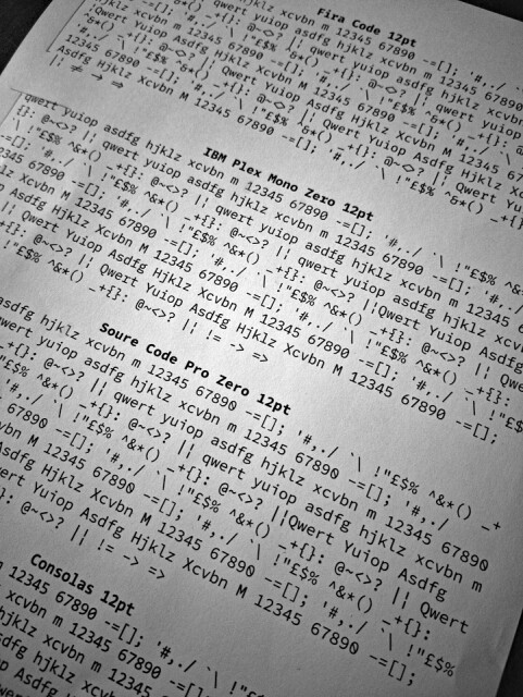
Today's back blip has some of the current monospaced fonts I have. At the top is Fira Code (there is also Fira Mono), which is a programming font so while it's fixed pitch it also combines certain programming symbols made up of two adjacent characters into a single double width glyph (you can see a few of these in the picture). It looks kind of cool and some people like it. The Mono version is basically the same but without the fancy ligatures.
Next is IBM Plex Mono (the Zero is my variant). I like this a lot but by default it has a dot in the zero and I prefer a slash, so I have a tweaked version which has the default changed.
Beneath that there is Source Code Pro (the Zero is my variant). I used to use this a lot until I changed to IBM Plex. Again I've a tweaked version because I prefer the slash to the dot on my zero.
At the bottom is Consolas from Microsoft, it's not perfect, but most Windows computers have it, so it's quite common. It has a slashed zero and it's not bad.
Comments
Sign in or get an account to comment.


