Pinky Performers
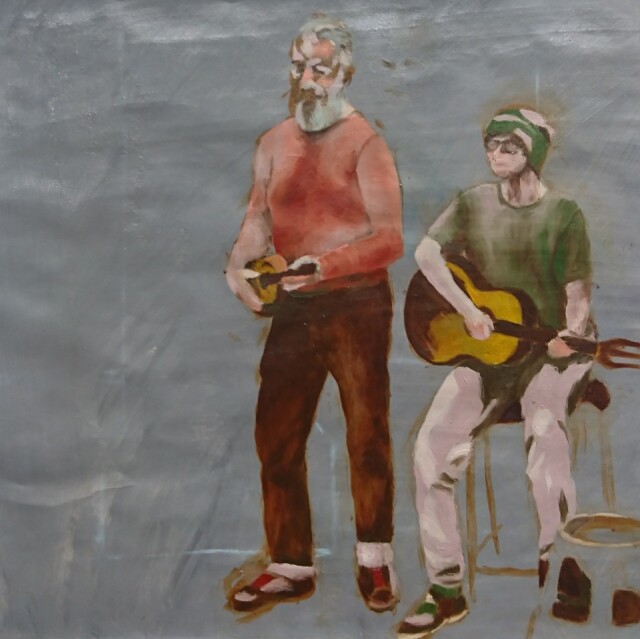
Today was my second session working on a painting of life models posing as buskers. We were working with a limited palette of colours we mixed prior to starting, which presented some interesting challenges. Usually when painting I can mix colours freely and adjust the tonal values as I go along, but here I had to choose the colour that was the best tonal fit (because I didn't have enough colours to try to be true to life).
I learned how different colours behave: you might expect a colour with a lot of white mixed in to be good for a highlight, but white also desaturates a colour, which makes it appear to recede compared with bright colours like a primary red. Warm colours will also appear to come forward, while cools like blue will recede. A dark but saturated colour like deep blue can even look like a hole, so a solution is to add some white to make it flatter.
The brief was to keep colours as unblended as possible, applying them like mosaic tiles, but I earned the licence to blend for the last twenty minutes because of the starkness of the colour patches in my case.
It needed quite a lot of thought and correction, so I was tired at the end of the day even though I didn't get around to the background!
34
views
- 0
- 0
Comments
Sign in or get an account to comment.


