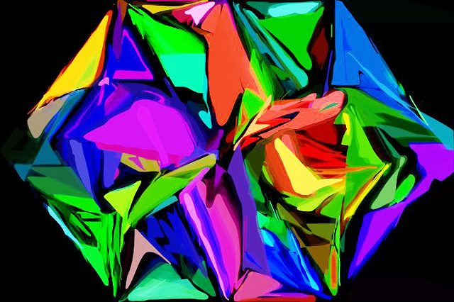
ColourWeaving Prayer
Today was spent relaxing in front of the screen doing some multimedia art to create a colour weaving prayer.
><>
A Summarized Understand of Colour
Red is the colour of fire and blood, so it is associated with energy, war, danger, strength, power, determination as well as passion, desire, and love. Red is a very emotionally intense colour. It is a colour found in many national flags. Use it as an accent color to stimulate people to make quick decisions; it is a perfect colour for 'Buy Now' or 'Click Here' buttons on Internet banners and websites. In advertising, red is often used to evoke erotic feelings (red lips, red nails, red-light districts, 'Lady in Red', etc). Red is widely used to indicate danger (high voltage signs, traffic lights). This colour is also commonly associated with energy, so you can use it when promoting energy drinks, games, cars, items related to sports and high physical activity. Dark red is associated with vigor, willpower, rage, anger, leadership, courage, longing, malice, and wrath.
Orange combines the energy of red and the happiness of yellow.
To the human eye, orange is a very hot colour, so it gives the sensation of heat. As a citrus colour, orange is associated with healthy food and stimulates appetite. Orange is the colour of fall and harvest.
Yellow is the colour of sunshine. It's associated with joy, happiness, intellect, and energy.
Yellow produces a warming effect, arouses cheerfulness, stimulates mental activity, and generates muscle energy. Yellow is often associated with food. Bright, pure yellow is an attention getter, which is the reason taxicabs are painted this colour in a America. Yellow is seen before other colours when placed against black; In heraldry, yellow indicates honor and loyalty. You can choose yellow to promote children's products and items related to leisure. Men usually perceive yellow as a very lighthearted, 'childish' colour, so it is not recommended to use yellow when selling prestigious, expensive products to men – nobody will buy a yellow business suit or a yellow Mercedes. Yellow is an unstable and spontaneous color, so avoid using yellow if you want to suggest stability and safety. Light yellow tends to disappear into white, so it usually needs a dark colour to highlight it. Light yellow is associated with intellect, freshness, and joy.
Green is the colour of nature. Dark green is also commonly associated with money. It is the most restful colour for the human eye; it is the colour of free passage in road traffic. Dull, darker green is commonly associated with money, the financial world, banking, and Wall Street. Olive green is the traditional colour of peace.
Blue is the colour of the sky and sea. Blue is strongly associated with tranquility and calmness. You can use blue to promote products and services related to cleanliness (water purification filters, cleaning liquids, vodka), air and sky (airlines, airports, air conditioners), water and sea (sea voyages, mineral water). As opposed to emotionally warm colors like red, orange, and yellow. Blue is a masculine color; Dark blue is associated with depth, expertise, and stability; it is a preferred color for corporate America. When used together with warm colours like yellow or red, blue can create high-impact, vibrant designs; for example, blue-yellow-red is a perfect colour scheme for a superhero. Purple is associated with wisdom, dignity, independence, creativity, mystery, and magic.
According to surveys, almost 75 percent of pre-adolescent children prefer purple to all other colours. Purple is a very rare colour in nature; It is considered to be the colour of perfection.
In advertising, white is associated with coolness and cleanliness because it's the colour of snow. White is an appropriate colour for charitable organizations; White is associated with hospitals, doctors, and sterility, so you can use white to suggest safety when promoting medical products. White is often associated with low weight, low-fat food, and dairy products.
Black is a mysterious colour associated with fear and the unknown (black holes). it is considered to be a very formal, elegant, and prestigious colour (black tie, black Mercedes). When designing for a gallery of art or photography, you can use a black or gray background to make the other colours stand out. Black contrasts well with bright colours. Combined with red or orange – other very powerful colours – black gives a very aggressive colour scheme.
195
views
- 0
- 0
Comments
Sign in or get an account to comment.


