
Nitty Gritty
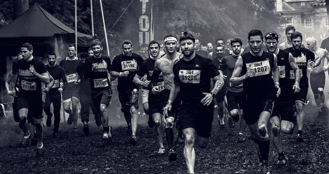
This was not taken today but its something I edited a bit differently today. In college we were experimenting different ways to turn a photo into black and white (apparently there are loads of different methods). To change this to black and white I used 4 adjustment layers.
1 - black and white. This is where you change the black and white tones eg. blue, red, magenta, yellow ect. By moving the sliders you get different looks on how deep a black is or how light a white is. I just messed about with them until i found something I liked.
2 - curves. I then used curves to further add contrast.
3 - levels. Same goes for levels, adjusting them (playing with them) till I liked the contrast it was giving me
4 - gradient map. This is something new that I learned. You will notice a blue sort of tint on the image. I'm sure I've seen this kind of effect on another blip users journal and I really liked it then. So it was interesting to try today for myself. To get this kind of 'tint' you would select a dark blue colour for one side of the gradient. And a sort of dirty orange or light browny yellow colour for the other side of the gradient. And then you would turn the opacity down on the layer.
Im not 100% sure as to what im doing yet. Im really just playing around. But i hope that i can look back at this blip, and thoes still to come, in prder to do some sort of revision. Any corrections is appreciated as it will help me, as well as anyone else in my position and looking to learn, out :)
Thanks.
Comments
Sign in or get an account to comment.


