
Bar Charts... In a Car?
At work we have recently received a new pool car - a Toyota Prius.
I was the first "lucky" person to have a go in it. I was worried as I'd heard they were tricky to get moving if you didn't know what you were doing. So I read a manual online before going near the thing.
It still took me 15 minutes to get out of the car park. Evidently there is a small pedal / button which releases the handbrake that I had failed to push. This pedal is tucked away under where your left foot naturally rest with it being an automatic. Why not just have a normal handbrake?
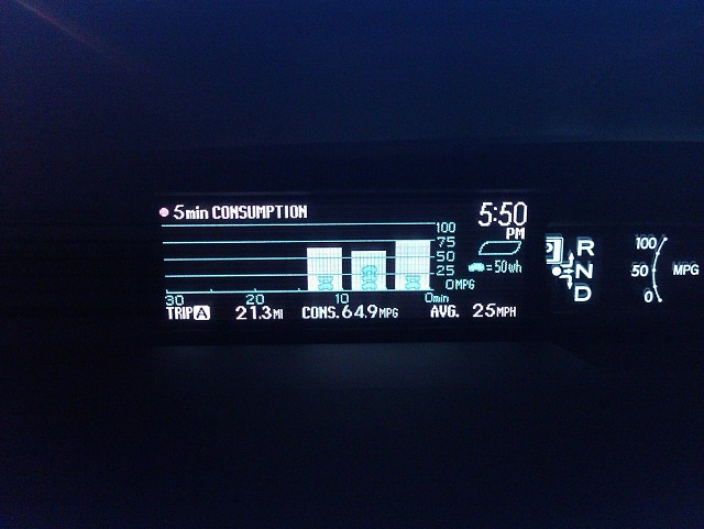
Once I was up an running I couldn't help get slightly distracted by the electronic dashboard telling me everything from speed, average speed, average fuel consumption and if the hybrid battery was charging to name a few.
After fiddling with more display options I found this setting. Bar charts illustrating my average fuel consumption for my journey in 5 minute intervals. Now, I am a self confessed geeky scientist but even this is a bit much for me. Graphs in a car? Madness
Then the real geek in me kicked it; "wouldn't it be good if you could download the data and compare results for regular journeys." Damn, I am sad I thought to myself!
Let's just hope I can get it off the drive in the morning a bit quicker than I did earlier in the car park!
277
views
- 0
- 0
- Vignette for Android
Comments
Sign in or get an account to comment.


