
FOOTE, 500 Court Street, Portsmouth, Virginia
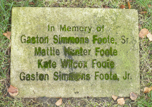
After yesterday's great weather day, this morning is a bit 'spitty', nothing that would drive a person inside, just enough to know there is more moisture which I think goes well with this moss covered memorial stone for the FOOTE family.
FOOTE Stone Memorial in Trinity Church courtyard/graveyard
500 Court Street, Portsmouth, Virginia
circa late 1900s
Here is my find of the day in my Urban Lettering Project & Topography Quest near the Tidewater Community College | Visual Arts Center | 340 High Street.
This stone memorial is set in a sans serif typeface. It is simple, direct and unassuming. I like the tall vertical height of the letters.
I also like (just call me odd) the way the two men's names are top and bottom in the design layout, somewhat like bookends. Their names are longer, because of the Senior and Junior, but visually they also are enclosing the shorter names of the ladies -- I don't know if the ladies are wives or daughters/sisters of the men, but they are definitely between them as though they are protected somehow. I like the balance of this; the overall weight and squareness it brings. The entire face of the stone is used in this design layout.
Try to picture this stone with the two men's names at the top followed by the ladies' names. Not only would the top of the list be redundantly repetitive (get it?) and boring since the two names of the men are basically the same, but it would also have put the shortest name on the bottom of the list making the entire composition top heavily and visually teetering, unstable, looking like it might fall over at any moment.
Even though this is a very simple assignment; I think there was some good thought put into the final design and overall execution which I greatly appreciate.
I also really liked the moss growth. The idea of moss gathering on a non-rolling memorial stone was intriguing. Of all the stones in the courtyard / graveyard this stone had significantly more moss growing on it. There was just one other that was a rival in overall moss growth, but it lost out due to layout composition.
My guess might be that this typeface is a version of Helvetica.
Based on: the lower case 'y' which has a little bit of a tail flip; the capital 'G' which has the strong straight horizontal and vertical elements making it a 'G' and not a 'C'; the lowercase 'w' has angled outside strokes rather than vertical strokes, which I think the uppercase might also have, which is typical of Helvetica.
AND it has a more vertical (narrow) orientation than a wide orientation.
AND Helvetica was designed in 1957 by the Swiss designer, Max Miedinger, so I think this typeface was available when this project was executed, and it was quite popular.
That is my guess.
Other urban topography & lettering photos in this series:
In Olde Towne Portsmouth, Virginia
All Saints Chapel : 500 Court Street, Portsmouth, Virginia, USA
Historical Placard Q 8A : 500 Court Street, Portsmouth, Virginia, USA
FOOTE Memorial Stone : 500 Court Street, Portsmouth, Virginia, USA
Bangel Law Building : 505 Court Street, Portsmouth, Virginia, USA
Portsmouth Public Library : 606 Court Street, Portsmouth, Virginia, USA
Pythian Castle : 600-612 Court Street, Portsmouth, Virginia, USA
Chapman Building : 310 High Street, Portsmouth, Virginia, USA
Coffee House Facade : 300 High Street, Portsmouth, Virginia, USA
Towne Bank Building : 200 High Street, Portsmouth, Virginia, USA
In downtown Norfolk, Virginia
Martin Building : 300 Granby Street, Norfolk, Virginia, USA
Velvet Lounge : 332 Granby Street, Norfolk, Virginia, USA
Madison Hotel : 345 Granby Street, Norfolk, Virginia, USA
The Fontaine Room : 345 Granby Street, Norfolk, Virginia, USA
238
views
- 0
- 0
- Panasonic DMC-FX12
- 1/4
- f/2.8
- 6mm
- 200
Comments
Sign in or get an account to comment.


