Cars...
... and boys.
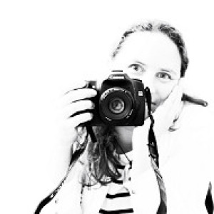
[finished version on my [url=http://www.blipfoto.com/entry/1371167]Kinda Horrigans[/url] journal]
The main difference with this image is that the final version is a high contrast black and white rather than this colour version. I can't resist black and white when you've got what will give you some nice contrasts between light and dark - like stripy tops or light falling on someone's face. So, this one I processed the RAW file - boosting the contrast just a tad... then opened in Photoshop. Created a new adjustment layer - you just do New > Layer then change the blend mode to overlay and pop a tick in the 'fill with overlay-neutral colour (50% grey)' box. Then, painted on the overlay layer - not the background layer - with a white brush to dodge the areas I wanted lightened and used a black brush to burn or darken other parts. I always work with an opacity of the brush set to around 5 - 10%. Anything more tends to be too much and you can always do more if you want.
After that, converted to black and white using Silver Efex Pro and a preset of High Contrast (Harsh) - then brought out some of the detail by increasing structure and bumping the contrast just a tad more. Once I'd done that, I sharpened, flattened... and saved.*
Tip of the day:
Today's tip is related to the image - if you want to get started with black and white photography then these 5 tips provide a good easy-to-digest place to begin.
* actually, I realised I'd completely burned the left hand side so processed the RAW file again - this time reducing the exposure a little - then did the Silver Efex Pro thing again. Then, copied and pasted this version onto the one above - applied a layer mask, then painted out everything other than the rescued left hand side!
296
views
- 0
- 0
- Canon EOS 50D
- 1/100
- 85mm
- 200
Comments
Sign in or get an account to comment.


