Content warning: turbulent text
I know I 'shouldn't' say this here but I'm going to and then I'll duck and later I'll apologise for hurt feelings.
No, I'll apologise for any hurt feelings now. Sorry. No personal offence meant. This is a post about looking under the surface of an image. Or not.
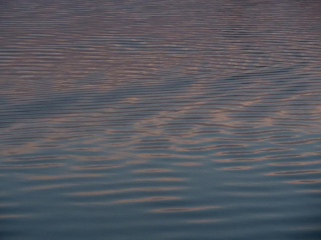
I spent sunset this evening watching varieties of turbulence being made very obvious, unusually, by the blues and pinks in the sky reflecting off water. Most of the turbulence was created by water birds but as soon as I included them my image completely changed and became a 'pretty picture'.
'Pretty pictures' frustrate me because, although I don't object to 'pretty' in itself, the tropes they contain (certain shapes, certain colours...) often elicit a clichéd response and stop people looking. It's as if they become slippery and the eye just slithers off them. I knew that if I included a bird my thumbnail would get the 'pretty' response and the bird would, for many people (though probably not my regular followers who know to expect the unpretty from me!) get in the way of seeing the patterns.
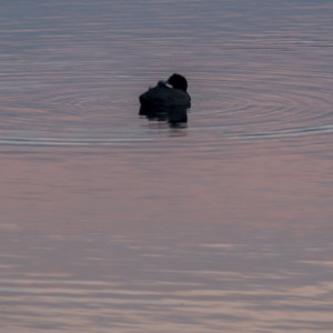
So I've chosen a bird-free image for my blip. I have included a bird in the extra so you can see the patterns it made but I've deliberately chosen the lumpiest version of bird that I could (even though I do have lots of prettier versions).
No hearts please. But do please tell me what you think 'pretty' does to the way we see.
Comments
Sign in or get an account to comment.


