
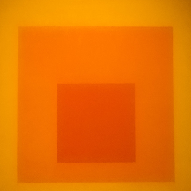
Homage to the Square
We made a return visit to the Op Art exhibition at Compton Verney today for a longer look at the art works we enjoyed most on the guided tour. Interesting for a photographer as it gives an idea of how placing one colour next to another can give an impression of depth in an image. I'll leave you to make up your own mind on this one which is homage to the square by Joseph Albers. Painted in 1964 it is one of series of similar works, each featuring a different main colour.
More info here on the Tate Gallery website.
Not entirely sure about the photography policy, but given that a google search brings up plenty of references to this work .....
Comments
Sign in or get an account to comment.


