
Contrasting styles
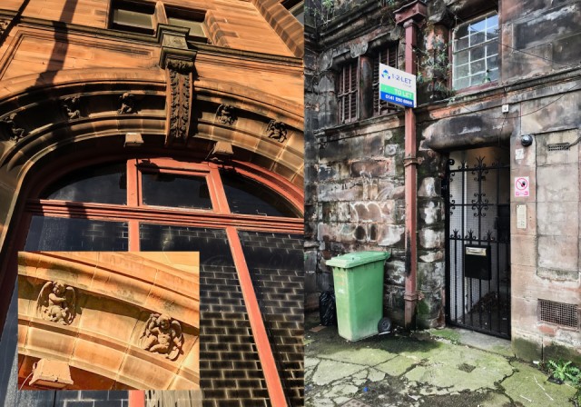
On Friday I photographed the facade of the former British Linen Bank at 215 High Street with its crow-stepped gable, statue at the apex and open lattice wooden dome. I mentioned that access to the flats above was through a grim gated entrance in the adjacent lane which had a broken window above and a general look of sad dereliction. To my surprise today, I noticed the gate at the entrance to the close had had a lick of black paint, a new shiny mailbox, the window above was reglazed, and a light glowed in the stairwell. The reason was the rental sign attached to the drainpipe. If I'd had anything to do with it I would have removed the weeds and bushes growing out of the masonery, powerwashed the green coating on the paving stones and washed down the bin! Even with the attempt to smarten up the entrance, it does not look to me like a 'des-res' - more like 10 Rillington Place comes to mind!
The inset picture is a detail from the arch over the main window on High St which is decorated by several putti. These were a popular Victorian feature derived from Greco-Roman classical mythological symbolising love. Is there a difference between putti and cherubs? These have wings and remind me of the cherubim scraps I used to collect as a child. Putti were reputed to be form-changing beings. Whatever they are they appear as real creatures morphing from the red sandstone of the building. The contrast between the elaborate facade and the rear entrance to the upper flats is as extreme as I've ever seen.
245
views
- 1
- 0
Comments
Sign in or get an account to comment.


