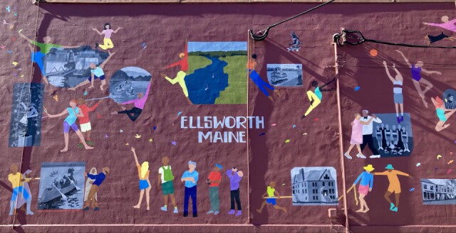
m u r a l
When I saw today's Wide on Wednesday theme was "Scene with people," my first thought was, "Well, I don't really photograph scenes with people."
Then I realized I passed one every day, and thought "why not get this off my chest?"
Unfortunately, the reason not to would be that I have nothing nice to say about this mural. I find it to be a disappointing waste of a good opportunity and an objectively poor example of the art form. Harsh? Yes, but there it is.
This wall always did seem like it would be a good place for a mural, so when I heard there was a plan to commission one I was briefly hopeful. Then I heard which artist had been given the commission and my hopes were dashed. It wasn't surprising, since the artist is local and apparently well known, but I knew their style wouldn't be suited for the space and I was right.
One of my main gripes is simply the awful waste of space. There's a whole wall to fill, and instead you cover a fraction of it with relatively small forms? Is this how to fill a canvas? At the least you could triple the number of figures to really occupy the space. This is a very large doodle, not a mural. Blipfoto is full of amazing photos of murals, and you will find very few that have approached the task in such a limited way. Such a lack of ambition!
I might have some limited patience and understanding of this approach if the mural was located along a walkway where people might easily approach the work and linger, taking in the detail, but that is absolutely not the case. To take this photo I had to pull over at a busy intersection into an unused lot next to a construction company and park by some cement road dividers. No one is walking by this mural. People are driving by this mural at 30 mph, or possibly looking at it across the way while parked at a light. So any of the details you might appreciate are just not going to be noticed, for a very obvious and predictable reason. This wall was calling out for something large and bold, and what it got was a bunch of very small and obvious things. Some of them even in black and white!
With that in mind, consider if this mural was, in fact, only in black and white. Just one or possibly two figures, in black and white. It would be better! Banksy has shown how powerful this form can be, but we see none of their creativity here. This mural is not enough, but it is also too much! What an awful achievement!
By this point anyone still reading might think I have some other axe to grind about this. Which perhaps I do. Personally, I think the mural as an art form reaches it greatest potential as an expression of liberation and freedom of expression for marginalized people or perspectives. That's my bias. So seeing this anodyne depiction of the local community just sticks in my craw. If all that was wanted was something nice and pretty, then just fill the wall with a flower or rainbow or something. It would have been a whole lot better. Right across the street is a thrift store that covered its outside walls with flowers, like this one I posted last year. This one daisy has a bigger emotional impact than the entire mural!
Honestly I probably would prefer some graffiti, as long as it wasn't explicit or blatantly offensive.
I've got much more I could say about this but I've probably been negative enough for now. At heart I'd like to think I'm not a harsh or unkind person, but I suppose I can be insufferable and callous at times, especially when I'm right about something!
Comments
Sign in or get an account to comment.


