Colour splash
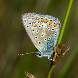
Gill positively hates it when I do anything to change an image, whether I make it monochrome or soften it markedly as I've done here.* If you are similarly afflicted enjoy the less adulterated one here. Have a good mutter about Photoshop just as I do when I see all those pumped up clouds and drama queen sunsets hereabouts. Each to their own.
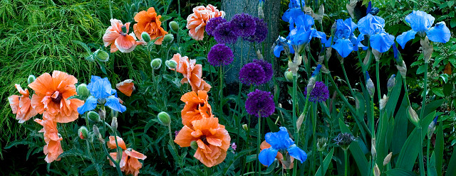
I don't like formal planting and love it when the plants do their own thing providing a splash of different colours. I waited until the sun had left this bed at the front of the house because only then can the lushness of the colour come through. I haven't turned up the saturation here, just the lush to bring out the splashiness, the impression I get every time I look at it. It's what the Impressionists did after all. When Renoir painted a nude he went for the flesh tones, not the sharp detail of the form. Monet did likewise in his flower garden at Giverny. I would guess that it's probably better large, as they say. What do I know?
I checked my premium bond number today and guess what?
*Just looked back at this after a few days. I agree now. The original is better so I've changed it.
391
views
- 1
- 0
- Nikon D200
- 1/100
- f/6.3
- 50mm
- 320
Comments
Sign in or get an account to comment.


