BBC and T in the Park
We use T in the Park as a project every year. An annual Scottish music festival as a client that generally students can really get their teeth into. Some have been, and others generally know people who've been or at least familiar with the festival, perhaps even through the extensive highlights packages on the BBC. I've never been, but have been to a bundle of outdoor gigs and know enough to think I'm, let's just say, not in the target demographic, from a festival and from a lager perspective.
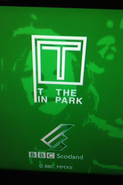
The image in the pic is the final frame in the closing credits of the BBC's highlights packages. I don't get it. That in itself is a phrase I rarely use in marketing communications - I may not like it but at least I get it, I don't like the visuals but at least I get it - those kinds of things. For this one though, it's a straight don't get it, a simple 'what?'
If you're not familiar, the standard T in the Park logo is the red Tennents red T with a bit of green grass at the foot. Tennents' red T is a marketing and design phenomenon - they've had whole ad campaigns without mentioning the full brand name. So overall it's a pretty standard, familiar, cosy and comfy logo. But the BBC them thinks that using the logo then uses the alcohol brand - so far, so guidelines and standards. But this green logo with a white pen going a straight line walk is a best superfluous, at worst, well, rubbish. Why create a new logo? Why even go there? When the BBC covers sporting tournaments, they see no need to create a new logo every time. This effort seems a lazy attempt to 'join in' to be part of a youth extravaganza, to almost try and be 'hip'. I think they're doing all of that by covering the festival in the detail they do - scrap it and continue the excellent festival coverage.
123
views
- 0
- 0
Comments
Sign in or get an account to comment.


