
Advertising as art
Sorry, it's not Thursday, but I have to have a rant.
Do you remember, there was a time when advertisers used to take pride in the look of what they produced. And before our time, in the 20s/30s/40s in particular, there were some stonkers: Eric Ravilious's work for London Transport, Paul Nash's adverts for Shell Oil, the wonderful Guinness toucan ads (tag line Guinness is good for you supplied courtesy of Dorothy L Sayers). The list is a long one.
It doesn't happen like that any more, does it? Since 2008 in particular ads seem to have got shriller - fuller of psychology about what makes us buy and infinitely less attractive. To be honest, they give me total indigestion.
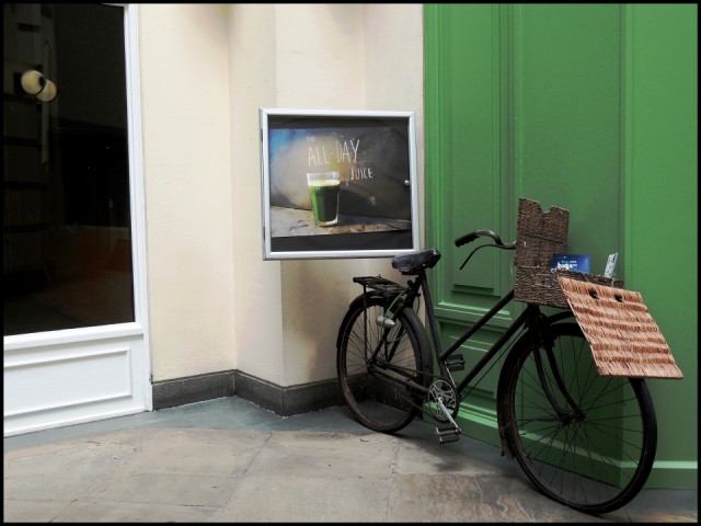
However, when I saw this is made me stop and look again. I thought the picture on the wall really rather lovely and someone had taken huge care (or so it seemed) to make it fit it's surroundings. The green juice the same shade as the cafe front (and even the bike lock), the blues, whites, black and neutrals all echoing each other. And no dreaded company name screaming at you!! So it's become my blip for the day. (And in case you're wondering what the 2 googly eyeballs are, they are a reflection of the nasty tasteful shopping centre lights.)
Have a good Sunday evening. Last episode of Poldark, so after tonight we'll have to stop objectifying Aiden Turner, isn't that right girls? As if we ever would.. xx
Comments New comments are not currently accepted on this journal.