And so here we are.
I have rotated this photograph and so left is top and right is bottom. It makes no difference visually but it might help to understand that when I begin to use words such as width and height.
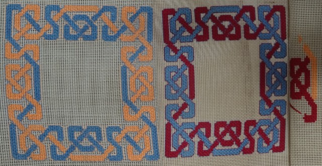
It is quite apparent that the mesh on the directors' chairs is not consistent. The first chair (red/blue) has a grid which is wider and shorter than the grid on which I based the original design, which is supposed to be almost square. To achieve the 'almost square' ratio of the design on the original mesh I needed to use four units width to equal three units height.
The second chair (blue/peach) is much closer to the original grid and therefore the overall design has ended up much closer to square and how I had wanted them all to be.
The third chair (peach/red) just begun, seems to have yet another distortion, in fact the grid is practically square, in which case I should have used a 3 x 3 grid not a 3 x 4 grid. I am not going to redesign the pattern for each chair and it just goes to prove that I was right to execute each one in a different colourway to minimise the perceived differences between the individual pieces.
It is rather irritating however.
Comments
Sign in or get an account to comment.


