
Mermaids
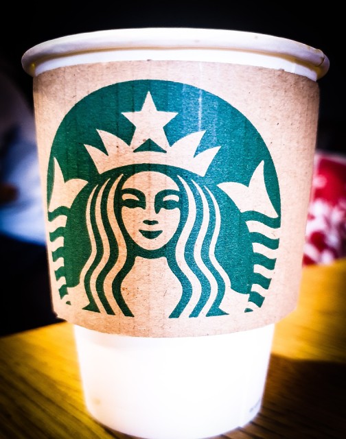
Since Starbucks was named after a nautical character, the original Starbucks logo was designed to reflect the seductive imagery of the sea. An early creative partner dug through old marine archives until he found an image of a siren from a 16th century Nordic woodcut.
What's less well known is that when she was created she was too beautiful as her face was symmetrical.. Both sides being the same. To ensure she appeared more human, the right side as you look at her, was given a bit more darkness in the form of a longer line going towards her nose!
Now your know. You can be too beautiful!
Comments
Sign in or get an account to comment.


